4 Key Components of Graphic Design
We use 4 key components in graphic design:
Color, Images, White Space, and Words to communicate a
message, but it's what you do with them that makes it pop.
1-Color is the most critical component in any
graphic design piece.
 •Color
can tie completely separate things together to create a theme, or
marry several design pieces into a campaign.
•Color
can tie completely separate things together to create a theme, or
marry several design pieces into a campaign.
•Color can create "pop" with the use of complementary colors to brighten something you are required to work with, but that isn't working for you on its own (like an existing logo).
•Color can even be used alone as a brand signature, like "Tiffany blue". Whether or not what you are looking at is from Tiffany & Co., when you see their unique shade, you make that association. (Their favicon is just a square of that color.)
Color associations can work for you, or they might work against you.
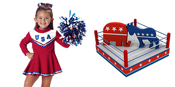
For instance, if you are American, when you see deep red, white, and navy blue, you might think 'patriotism'. Your client may feel those same colors are 'political'.
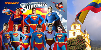
When you see the bright primary colors red, yellow, and blue, you may think 'superheroes', your client may see only the Colombian flag.
You see . . . Your client sees: You see . . . Your client sees:
Knowing the many associations made with color
and images is one of your most complex and versatile graphic design
tools. If you stay current, you can create associations with the
latest 'looks', and people will make the connection, maybe without
even realizing it.
2-Images are the second most critical component particularly because of the accompanying associations, and because they are often used simply for their color.
One of the things I love most about the field of Graphic Design is how often it can reinvent things and change we way we think. A client asked me for something "techy looking", so I obliged. Turned out we had different associations of 'techy', so I asked for a sample of what they had in mind. This is the ad they offered:
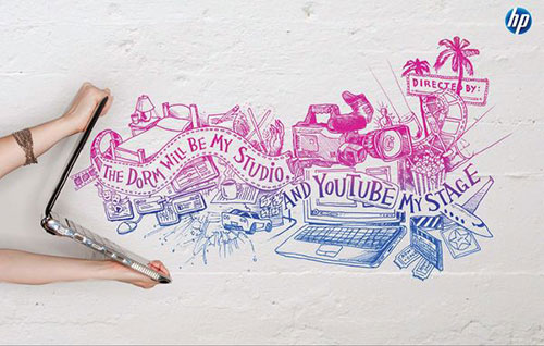
One of the genius "The Computer is Personal Again" ads by Goodby Silverstein & Partners for Hewlett Packard.
 The
use of drawing by hand to create a typeface and not using a font was
a friendly association as a throwback with an intentionally
non-technical feel. The drawing makes the technology friendlier,
more 'person'-al. Their tagline "The Computer is Personal Again" is
perfectly represented in a non-techy way. What my client really
wanted was a drawing. That she associated drawings with being
'techy' is just a testament to the effectiveness and dominance of
the ad campaign for this one specific tech company.
The
use of drawing by hand to create a typeface and not using a font was
a friendly association as a throwback with an intentionally
non-technical feel. The drawing makes the technology friendlier,
more 'person'-al. Their tagline "The Computer is Personal Again" is
perfectly represented in a non-techy way. What my client really
wanted was a drawing. That she associated drawings with being
'techy' is just a testament to the effectiveness and dominance of
the ad campaign for this one specific tech company.
Graphic Designers used to look at art, books, magazines, television, and thanks to Andy Warhol, everything else, to inspire us. As we went digital, I started looking at friendfeed, istockphoto, tumblr, flickr, photobucket, colourlovers, instagram, and pinterest. Now I collect images on pinterest the way we used to tear out magazine pages. The boards are like scrapbooks: color schemes, inspiration, single colors—whatever theme you spend the most time looking for, start saving those images as you run across them. It really helps when you are feeling stuck, creatively, and will help you find the kind of image you need to get your idea across.
Even if you find the perfect image, you may not
be home free. There is yet another component you might need to
consider . . .
The most under-appreciated design component is 3-white space! Many times when a design is not working, it's because there is too much stuff. A common obstacle to good design is the client who feels they have to put in everything about their company in every piece; that every piece should say everything about them. Not necessarily, or, not in so much text (which is usually what they want).
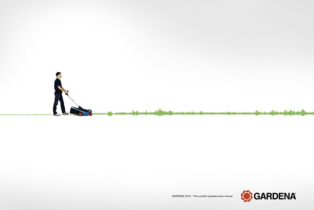
The ad below uses white space to suggest the lawnmower is quiet. Do you really need to know how long the company has been in business, their store locations, hours, and other products they offer? No. As a clickable web ad with the simple tagline "The world's quietest lawnmover", this ad says all it needs to say. That's why images are so critical, and why you have to know when to say no in order to preserve their effectiveness.
I often think there is no such thing as too much white space.
4-Words are good—when they're great, otherwise they tend to be ignored. A graphic design piece with no image is usually using words in place of an image, or cleverly, like the IKEA ad below, as both.
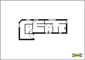
You've got to be short and sweet. In words, you can't get much shorter or sweeter than "Create". It covers everything IKEA offers and the experience of shopping there (if you've never been, they have model rooms set up), plus it is a call to action!
Most people don't want to read a lot of text. If you don't capture their attention visually, you can forget how well written you think your paragraph is.
Web ads are much smaller than print ads and there is even less room for a bunch of stuff and the ability to make an impact. I love this article: Biggest Mistakes in Website Design 1995-2011 because it cuts to the quick! Many of the principles apply to graphic design: This one is particularly on point . . .
 "A
man from Mars can't figure out what your [ad] is about in less than
four seconds."
(I
substituted the word "ad" for "website".) Many times the reason you
don't know what an ad is about is the important words don't have the
proper visual weight. Too many things are the same
size. What you want your reader to know first should be the largest
font size and then go down in size and importance from there.
"A
man from Mars can't figure out what your [ad] is about in less than
four seconds."
(I
substituted the word "ad" for "website".) Many times the reason you
don't know what an ad is about is the important words don't have the
proper visual weight. Too many things are the same
size. What you want your reader to know first should be the largest
font size and then go down in size and importance from there.
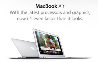
Something I also see a lot is when a line breaks to two lines, and the choice was not made to break it at the complete thought. Apple gets it right, of course, but it's surprising how often I see the sentence just allowed to break wherever.
As is:
With the latest
processors and graphics, now it's even faster than
it looks.
Break at the complete thought:
With the latest
processors and graphics,
now it's even faster than it looks.
How words look is as important as what they say. Pick a site you like and check it when you are feeling stuck. Apple.com gets everything right. Colors, Images, White Space, and Words. Less = More. More focus on the right things, more effective communication, more impact.
As
ChurchMag
puts it:
"Good ads tell us about a product. Great ads tell a story."
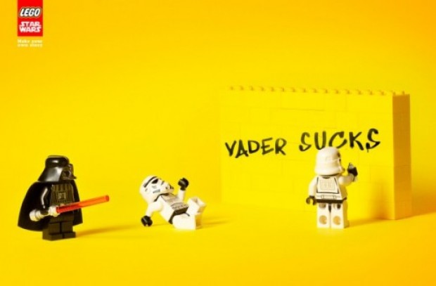
The words/ad should tell a Story. Any good graphic design piece uses the key components to send a message. Color, images, white space, and words, plus the associations you make with those choices, can creatively communicate your message. Great graphic design pieces uses the components so that the message becomes a story, like in the ad above: playing with Lego Star Wars toys is fun.
What's the alternative? You could just have a white background with the tagline "Playing with Lego Star Wars toys is fun" in black letters, and the Lego logo, but that would not make you smile. That would be the message without the fun. Of course, the bright yellow makes the piece "pop", but this ad is more than just the 4 key components of the design, it's the impact of a story.
Next time you see an ad you like, ask yourself,
what's the message, does it pop, and does it tell a story?
|
Recent Posts |
4 Key Components of Graphic Design
Twitter News:
Quick Promote and
Google Search
Understanding
Image Sizes
and
File Types
Building Your Visual Vocabulary
The
Prevalence, Appeal, and Use
of Graffiti-Inspired
Images
How To Be A Better Blogger Or How To Start If You're Still Just Reading